Sunday, 12 May 2013

Penguin Books


Penguin Books are publishers were founded by Allen Lane in 1935 because as he said back then 'if you wanted to read a good book, you needed either a lot of money or a library card. Cheap paperbacks were available, but their poor production generally tended to mirror the quality between the covers.' (Penguin Books). Through the years Penguin Books were distinguished by their simple cheap and efficient paperback printing as well some very iconic book covers. The book covers for penguin started out very simply with only element of typography. Later on they included illustrations with 2 colored systems as well as different colors for different genres. A style of covered created in 1965 by penguin was one particulary interesting and in my opinion one of the best invented by them. It was a harmony between text and image. It worked so well i even done a cover for typography using this style which i really liked. Nowadays the Penguin Books entered a modern style of covers which seem to be OK to me, nothing fancy, but this style is also not really liked by some.
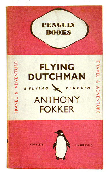
Early Penguin Book Covers

2 Colored Penguin Books

Modern Penguin Book Cover

My Penguin Book Cover


Sources:

Penguin Books, [online], available at: http://www.penguin.co.uk/static/cs/uk/0/aboutus/aboutpenguin_companyhistory.html, [accessed at: 10/05/13]

Image Links:

http://static.guim.co.uk/sys-images/Guardian/Pix/pictures/2012/10/30/1351602296049/Flying-Dutchman-by-Anthon-001.jpg
http://bookdesign.paulmurraydesign.com/wp-content/uploads/2011/05/marber1-640x1041.jpg
http://s1.v2img.anobii.net/edition/pi96a798eddb8686ef@large.jpg

Drum & Bass & Posters

Drum & Bass is one of the most alternative music genres and is one of my favorite. It's roots were set here in United Kingdom, especially in Bristol and London in early 1990's. Over the years it branched out to different sub-genres and became very postmodern having 'liquid drum and bass', 'acid drum and bass' 'Jump-up drum and bass', 'Jungle drum and bass' and so on. Now Drum & Bass is quiet popular within the underground scene having weekly events around in London clubs and around the world. But the main tool for creating Drum & Bass, or any type of music, more known is through posters. I've seen a lot of drum and bass poster production works and i have to say they were quiet attractive to eye. A lot of them simply use typography but the layout usually is well placed and considered. And that's the ones i like, because there's also plenty of rubbish ones too. Shogun audio and Critical Sound probably creates one of the most typographically appealing posters from drum and bass scene.

Shogun Audio


Shogun Audio


Critical One


FabricLive London


Image Links:

http://sphotos-d.ak.fbcdn.net/hphotos-ak-ash4/319918_10151608403711202_1396778879_n.jpg
http://hangout.altsounds.com/geek/gars/images/3/4/5/6/3/fabriclive_22.3_.jpg


Micheal Weinstein Re-designs

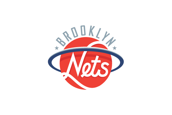
Once I've been  looking for NBA logos and came across this guy Mucheal Weinstein, a guy from Cambridge, Massachusetts who is like me, is interested in basketball but is also interested in remaking the current logos and overall has a specific ways of creating illustrations. What he might lack is looking at his work from different angles, creating everything from scratch. But then again, it's his specific style to introduce history throughout logos. And his logos are very simplistic containing a few and similar color pattern as he seem like a person who does not like complexity. He is also very delicate and clean with his work, like a celebrity chef making a dish on TV. He also creates illustrations, typographical work for websites, but to me they do not seem to be as interesting as the work he has created on NBA logos.


Brooklyn Nets

Los Angeles Clippers
Indiana Pacers

Oscar Travesties website

Image Links:

http://www.michael-weinstein.com/wp-content/uploads/2011/01/clippers.jpg
http://www.michael-weinstein.com/wp-content/uploads/2011/07/pacers1.jpg
http://www.michael-weinstein.com/wp-content/uploads/2013/02/lead_image2.jpg
http://www.michael-weinstein.com/wp-content/uploads/2010/11/nets1.jpg


Adverts - Innocent

This particular advert was created by one of my Graphic Design tutor Dan Duran in 2008. It's for a smoothie commercial called 'Innocent'. What particularly interested me in this advert and probably the reason why it sanded out so much out of all the adverts was because of its simplicity and honesty. The whole brand 'Innocent' and the message this advert gives out meshes up well together. It was created using a serious of images put up together which is very simply and money efficient. Whats more is that it gives a lighthearted 'innocent' joke of a chicken walking across the camera adding more towards the good 'innocent' feeling. Overall this advert seemed like a big success and Dan mentioned that it increased 'Innocent' smoothie sales too.

Peter Saville and Album Covers

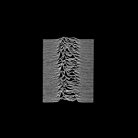
Peter Saville is the unsung hero of modern day album covers. I've recently found out about him and started to admire all the things he has done. He created his first cover in 1979 for Joy Division and become an icon. Over the years he also created covers and sleeves for New Order, Orchestral Manoeuvres in the Dark and more. His ironic, minimal works work using colors and simple (sometimes complex) typography always create this feeling that it's not ordinary but it feels just like for music as music does not usually need words to describe itself. Just like from his album cover from suede - 'coming up'.One of my favorite album covers now seem like it too come from the same angle Peter Saville uses to create his own. It's a FabricLive album called 'Fabriclive 44 - commix'


Suede - Coming Up

FabricLive 44 - Commix

Joy Division - Unknown Pleasures

Basketball / NBA

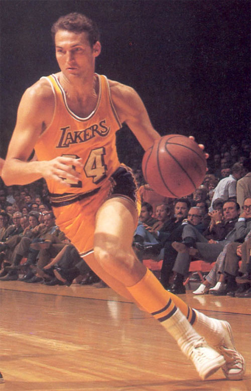
I had to do on this one. Basketball is a sport consisting of a hoop and a ball. It's usually associated with black African-Americans and is watched mainly by social and middle class people. But I'm a Lithuanian which is white eastern European and basketball in Lithuania is called 'the second religion'. NBA is the best professional basketball league and boast some of the most paid athletes in the world. There's also a big graphic side to NBA as well. All of the team logos are one of the best looking around. The league it self is only one of the few professional sports and the only professional basketball league not to have include advertising on their playing shirts. Even though this is going to change in 2014. But probably the most iconic logo is the NBA red white and blue logo of Jerry West created in 1969 by Alan Siegel. Now 'this classic image generates $3 billion a year in licensing, and the NBA name symbolizes the pinnacle of excellence in professional basketball.' (Logo Design Love)

Jerry West inspired the NBA logo

NBA Logo


Cleveland Cavaliers team logo


Miami Heat team logo


Lebron James - most paid basketball athlete in the world wearing non advert NBA shirt


Sources:

Olly Moss

Never heard of him, never seen his work. No wonder, because Olly Moss is only 25 year old Graphic Designer (Prezi.com), but already showing a lot of talent. He is a guy who does a lot of remaking of posters. His style looks... 'cool', a word probably that would probably best describe what he does. He seems to be fond of using fewer colors as well as silhouettes of people. It does creative a nice effect but it keeps nagging me that I've seen work like this before somewhere. Nevertheless this simplistic work is probably a start of his career but he's definitely talented and seems like this is only the beginning of exploring such style for him.

Dirty Harry


Star Wars


Les Miserables


Sources:

Prezi.com, [online], available at: http://prezi.com/-znsoewj2eov/olly-moss/, [accessed at: 10/05/13]

Image Links:

http://beyondthemarquee.com/wp-content/uploads/2012/04/dirty_harry_movie_poster_rolling_roadshow_2010_olly_moss.jpg
http://binge.com.au/sites/default/files/images/blog/olly-moss-2.jpeg
http://collider.com/wp-content/uploads/olly-moss-les-miserables-mondo-poster.jpg


Jonathan Ive

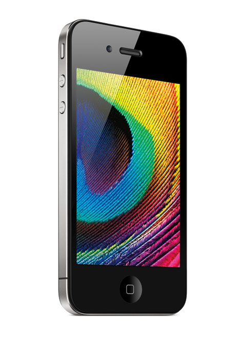
Any Apple fan is going to know who is Jonathan Ive. 'Born in 1967, London, where he spend most of his childhood' () he is the leading designer of Apple and designed products such as 'iMac, iBook, Cube, Powerbook G4 and iPod MP3 player' (Design Museum). He is one of the most successful designers of our age who changed at how we look at our products. He is the guy who inspired slick minimal and thin designs of iPods and iBooks. Even not being an Apple fan, he's designs shifted everything. After all iPod is the most sold MP3 player in the world and it style was one of the main reasons. He is a winner of many awards, especially noted for 'Wins the Design Museum's first Designer of the Year prize' (Design Museum)


 iPhone 4


PowerBook 4


iPod


Sources:

Design Museum, [online], available at: http://designmuseum.org/exhibitions/online/jonathan-ive-on-apple/jonathan-ives-biography, [accessed at 10/05/13]

Image Links:

http://s3files.core77.com/blog/images/0iphone420122.jpg
http://apple-history.com/images/models/pg4_15_800.jpg
http://www.os-3.org/wp-content/uploads/2012/06/Apple-IPod-Classic1.jpg

Laszlo Moholy-Nagy

Laszlo Moholy-Nagy is a Hungarian artist born in 1895. He is considered as one of the main artists of Constructivism with  'his own abstract style influenced by Malewitsch and El Lissitzky' (Moholy Nagy) He was also a professor in the school of Bauhaus where he was a master. A lot of his 'ideologies related to the relationship between space, time and light and the interaction of man with these forces' (Museum of Modern Art) which explains his approach towards his painting. This is an artist I've never heard of and since abstract is an interesting topic of art to me personally, i really like his works which contain full of geometry and overlapping colors. He paints them with a lot of perspective and dimension showing a full awareness of space and time which creates different viewing angles for his paintings. The overlapping colors just add to that effect giving the painting a truly strong abstract look. And thats not one of his painting. It's actually a all of his paintings that are like that

Composition

Composition A-II

Yellow Circle


Sources:

Moholy Nagy, [online], available at: http://www.moholy-nagy.eu/, [accessed at 10/05/13]
Museum of Modern Art, [online], available at: http://www.moma.org/collection/artist.php?artist_id=4048, [accessed at 10/05/13]

Image Links:

http://rosswolfe.files.wordpress.com/2011/08/f99ssaid3.gif
http://rosswolfe.files.wordpress.com/2011/08/moholy-nagy_composition_a_ii_1924.jpg
http://arttattler.com/Images/NorthAmerica/NewYork/MoMA/Geometry%20of%20Motion/MoholyNagyYellowCircle.jpg

Identity

Identity can be answered by a question of 'what this/it/he/she is?'. But that's the simple part. Identity can vary between age, culture, social status, gender, race, health, nationality and so on. And a simple fact of life is... everyone and everything has an identity. The world would not exist, if not for identity. Everything would just float in space, not only for humans, but even for nature itself.


Identity: Upper class, 20th Century, Rich, Male and Female, White, Healthy, Privileged, English, Young


Identity: Woman, 20th Century, Lower Class, Female, White, English, Middleaged


Identity: Unemployed, Young, White, European, Male, Lower Class, Poor, 21st Century, Unhealthy


Image Links:

http://images.publicradio.org/content/2009/06/04/20090604_couple_33.jpg
http://www.bbc.co.uk/wales/history/img/themes/periods/wwll/446x251/factory_worker.jpg
http://upload.wikimedia.org/wikipedia/commons/2/23/Beggar_in_Dublin_(1).JPG


Modernisim / Postmodernism

To me the different between Modernism and Post modernism is that Modernism is a serious no-nonsense thing (item) without any extras and has a function that it does and nothing. Post modernism is the same object expect it has a soulful, emotional and overall a colorful side. It still does it job but there's just more to it. It's like a Banker and an Artist. A light bulb and a rainbow. But all in all there's more between the two together and even so by now it's not clearly understood exactly what Post Modernism is.


Modernism


Mies van der Rohe was an architect that was the 'last director of the Bauhaus school from 1930 until its disbandment in 1933' (Design Boom) Even though he had a lot of very interesting and actually good looking modernist designs that i would love to have (Like the Barcelona couch for his Barcelona Pavilion) none of them were build because of the economical situation in Germany.


Post-Modernism

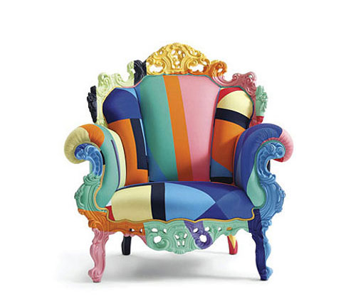
If modernism catches your eye with its slick no nonsense designs, Post modernism, in my opinion is even better. The Memphis Group is probably the most known post modernist designers creating a lot of fabulous looking furniture pieces with lots of colors and characters. Their work has to be a representation of what a lively house should have.


Sources:

Design Boom, [online], avalaible at: http://www.designboom.com/portrait/mies/bg.html, [accessed at: 10/05/13]

Image links:

http://homesthetics.net/wp-content/uploads/2012/11/ludwig_mies_van_der_rohe_barcelona_couch.jpg

http://www.officefurnitureexpress.co.uk/images/seating/sagal/classic/Mies_Van_Der_Rohe_Barcelona_Chair.jpg
http://www.laceeswan.com/wp-content/uploads/2011/08/Memphis11.jpg
http://farm9.staticflickr.com/8078/8330877298_c8e144abbd_n.jpg


Semiotics

To be very basic, the study of semiotics is the study of signs, but it doesn't end there. A sign could be just it - a road sign, a pub sign or a sign to the closest toilet. But there's more. Semiotics can contain a variety of elements like signs, symbols, Iconic Signs, Denotation, Connotation, Myths and more (University of Vermont) Semiotics to be more specific is the learning of the way people understand each other, the way people create ways to understand each other and communicate between each other. But even then, there are things like culture that direct the meaning of the sign.


Sign

A sign could be anything to communicate and it come in any sort of form. It can be Spoken, Shown or even smelled. A toilet sign is a basic sign that communicates to us where we can get... a toilet. It was invented by Samuel M. Genensky.


Symbolic signs

These are the signs that are purely about relation between the signifier and signified. They can vary between different cultures. Here's a great advert by HSBC that simply explains it.


Denotation

Denotation is what does literally sign mean. For example, an apple is a fruit.


Connotation

Connotation gives some sort of meaning to a word. It could be giving an emotion to a sign and connotation usually differs culturally. For example an apple in United Kingdom could mean 'healthy' while in Africa it could be look as survival from hunger.


Sources:

University of Vermont, [online], available at: http://www.uvm.edu/~tstreete/semiotics_and_ads/terminology.html [accessed: 10/05/13]

Image Links: 

http://img2.etsystatic.com/004/0/6000195/il_fullxfull.365434374_tscn.jpg
https://blogger.googleusercontent.com/img/b/R29vZ2xl/AVvXsEjFbY-PEaS4OUWP6bry-sxDOSH7vBdFnfjpUgCb578xeK-0SIzicqTECOAeE0dLPvnWxiveEcndrTJoVcmwol8qPShh-AS4Hhp-qDrGuVyLydO1C91a_pBKFjBydSjcgLieb9mdXaE-2tsc/s1600/apple2.jpg
http://www.crcl.net/images/page/89_boy_taffle_apple.jpg

Video Link:

http://www.youtube.com/watch?v=rZ-qFNrrt0E